Hello Sai!
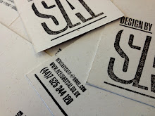
Sorry for the slow reply. We've been really slammed here. Thanks for writing to us and sending a sample of your work. You have a really beautiful aesthetic. And your posters were awesome! What a great concept with excellent copy. I wish I had thought of it. If you ever end up producing more of those posters, let me know, I'd like to buy one.
I'm glad to hear that you're interested in sustainable design. It's certainly a worthwhile industry and we can use all the members we can get. As for breaking into the field, I would imagine that the UK has many more green design studios that America, so obviously it would be best to try to work in one of those. Asking for informational interviews and portfolio critiques is a great way to meet with design studios and show your work without pressure on either party to actually work with one another (but it can still easily land you a job). Apart from getting in with a green design studio, just working at any design studio to gain experience in the industry, all while educating yourself about green graphic design is the next best thing. We have a list of books and websites on the resources tab of our Sustainability page that can get you started. It's a constantly changing industry due to new papers, materials and technologies, so self-education is really important.
Since I'm not a designer, I passed your portfolio along to Gage and asked him to give your work a critique from his more educated perspective. Here are his thoughts:
The posters are great. Love the copy and how you let the hand-made paper take center stage and then drove the point home with the simple typography and brilliant message. Nice work.
On the Shade of Green project, I like your thinking and how the package can become something useful afterwards. It shows that you're thinking through the life-cycle. However the images don't really demonstrate the potential of the piece. It would be nice to see the finished pencil holder. It may be better if you show a shot progression - showing the complete package by itself, then the interior with the booklet (but more zoomed out so we can see the contents, and finally the completed pencil holder next to the instructions. That way you the viewer can quickly see what you accomplished without reading and analyzing the pictures. Oh and the photos in the PDF could use some color correcting and white balance adjustment to really showcase your work.
The concept of the Natural History Museum identity is really interesting, however, the detail in the illustrations gets a bit lost on the smaller "n" icons. You might want to tweak those so they work well at smaller and larger sizes—either with finer lines/details, or by simplifying the drawings. I think the strongest versions are the ones that use the illustration as the negative space of the "n", like the shark, and the flamingo?. The triceratops is close as well. It would be great if people see an "n" first and foremost, and then notice that the negative space is actually an animal of some sort. Then with the logotype, I feel like the space to the left of "History" is a bit awkward. I would suggest that you either rework the type to avoid this space, or make some good use of it—maybe by using smaller type to add the name of the city the museum resides in. The use of the illustrations in the collateral is really nice though, nice work.
On the Plan A logo, I'm not really sure what the mark is, but I like it:) and your type is really elegant. During a face to face interview you'd have the opportunity to explain how you arrived at the mark, which will help. As for the animation, I would suggest making the text easier to read by letting the illustrations move around a static text area so that the viewer can read it all. Though I think you were trying to get across the many pledges people were making, my eye was not able to follow both the text and the images, so I often felt like I was missing something important. We don't do motion graphics, though, so that's a bit of an un-educated opinion.
Hope all that was helpful and again, I'm sorry for not getting back to you sooner. Thanks for reaching out to us and feel free to ask any questions to me or to Gage at gage@modernspecies.com.
Take care,
Jennifer Stewart
:: Modern Species LLC
:: a brand design studio
:: 608.467.0162 office
Official Adopter | The Designers Accord
On Jun 21, 2011, at 11:11 AM, Praefa Uennatornwaranggoon wrote:
Dear Modern Species,
I am a Graphic Design student at the Leeds of Art in the UK and attached to this email is a PDF of some of my work. I have a growing interesting in sustainable Graphic Design and I am looking make it a part of my design practice. This is one of the reasons I found your studio so appealing. The other was that I have noticed that you work across a range of discipline from print to branding to web which is something I try to do in all my projects. I know that it would impossible for me to ask to pay a visit at your studio as it is all the way in Wisconsin but I would really appreciate any kind of feedback on my portfolio. I would also be really grateful for any advice on pursuing a sustainable graphic design practice.
P.s I am a little bit in love with you Rollup Logo and packaging :)
Best Regards
Sai Uennatornwaranggoon